Oct 14: Amendment to the Color Breakdown section due to some newer findings.
Introduction to my CPS2 Sprite Observations |
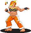
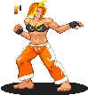
Before I get to the real meat and bones of this article, I'd like to cover some of the build up that finally got me to start this thing up once and for all. Basically since I launched this iteration of IRWT and started in depth studies of the various sprite styles associated to Capcom and SNK fighting games, I've given a pass to the general style used in CPS2 and CPS3 games. Avoiding the CPS3 review could make some sense due to the rather sizable color count needing some extra studying, but the fact I've already made a minor breakdown on another page in this same section along with a test sprite of Ibuki based off official line work means I probably have enough understanding to get around to writing it. The key reason for the delay is that I wanted to get around to writing the CPS2 review first, which despite technically being simpler as it only has 16 colors is problematic as I had not solved the rhyme and reason behind how color distribution has been handled. After talking to a couple of other sprite artists on the matter, we generally agree that at least part of the process had to have been automated as some of the darker tones within these frames appear in illogical places that certainly would have not been done by hand. I've got two real reasons for finally getting around to making this CPS2 study: the first is so that once it is done, I can get back on track to finishing all the remaining Capcom studies, being CPS3 and SF2 era sprite styles. Once those are done, I can possibly start on some of the vintage SNK titles, or maybe even branch out to some newer companies' work. The second reason is that I decided to take a crack at a new project out of personal amusement which involves me appropriating (probably closer to outright stealing to be honest, hah!) Steamboy33's take on what a CPS2 era She Hulk would look like and making a complete set of sprites out of it. To get to that goal, it kind of helps to know the style you are trying to ape, so I figure this is a chance to kill two birds with one stone and get it done with. What I will say now is that this particular study may become the most elaborate one I've made to date because it also serves as a stepping stone to the CPS3 style. You may be in for a long read....
|
|
While I've already come to the conclusion that some automation is clearly afoot here, there's still enough logical things present that an overall set of rules can be established to work with. Before I start listing any of the common rules, I need to make clear at this time that I will mostly be referring to sprites that were developed in 1995 and beyond, as the earliest examples (i.e. the original Darkstalkers game) utilize what I consider a prototype version of the style that later games built further upon. I will indicate if there is something game specific though as I go along.
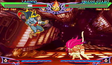
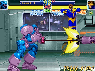
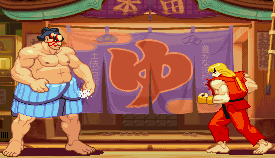
The first thing to keep in mind is the light source on CPS2 sprites both come from above and slightly in front. The second thing is that the official color limit is 16 colors with the transparent shade. This is fairly consistent throughout the games, although some outliers do exist such as Tron Bonne and Wolverine in Marvel vs Capcom 2: they stand out as their sprites are actually composed of multiple parts to allow them to actually surpass the 16 color limit. The finished sprites originally began out as hand drawn illustrations which were later scanned in / digitally captured and colored in by Capcom's artists. While I cannot say with full certainty to what extent it was done, I can fairly assume that the shading was likely blocked out for the most part, and the darkest shades were left for an automatic process of some sort to finish up. The reason I'm fairly certain of this is that you can find many an example where for some reason you have the darkest shades of a certain color appearing in odd places as opposed to the edges where you would expect them. |
||
As I've mentioned beforehand, the native resolution of CPS2 games was 384 x 224 pixels, which is more suitable to a widescreen format. As this wasn't available in most arcade monitors, the output would get compressed on the x axis to fit, effectively giving the sprites a thinner appearance. When you look at the sprites at their original scale, they can appear somewhat on the fat and short side if you are more accustomed to their 4:3 look.
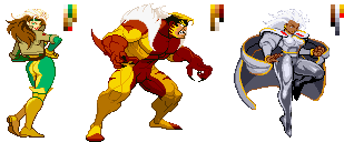
The Capcom Universe is on Steroids (or demystifying Capcom proportions):
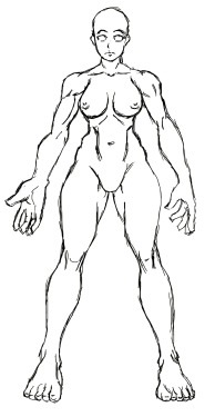
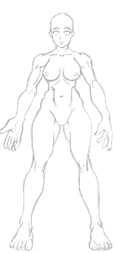
When it comes to the other gender, it is actually much less varied. In fact, it was possible to make one general body build image that with minor modifications actually fits 9 out of 10 of the female fighters you can find in these games. The differences between one character's body to the next is usually no more than a combination of cup size, muscle or fat percentage, and some height and width differences. Probably one of the few female characters that doesn't completely fit into the mold is Elena, and that is only because of her height making her more lanky than the standard female build allows for. Basing things off what can be found in Capcom art, I was able to successfully recreate the proportions used for Morrigan, Cammy, Sakura, and Chun Li with minimal real change to the template aside from what I've mentioned from above along with a new head. While in actual practice you would be better off shrinking the forearms like what is shown in the Sakura and Cammy examples, the general template shown works as a good starting ground. Line art is king:
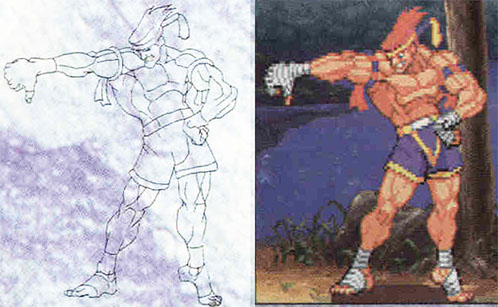
I came across a set of scanned pages from an unknown art book [update: It has been identified as the Street Fighter Alpha 2 Official Strategy Guide, released by Versus Books, thanks AudioVisual] that contained line art to sprite comparisons from SFZ and DS games. This was one of the larger examples, Adon giving a thumbs down pose. Although some details ended up getting changed a bit such as Adon's jaw and smile, and how the bottom of his shorts on his back leg rests, most of what you see on the original lines carries over to the final sprite. You might notice that some areas of the line art appear to have marks that don't appear in the final version. Adon's knees have lines going through the center of them, which actually work as shading markers for the final sprite. This sort of detail doesn't necessarily appear much elsewhere on this frame, the other prominent example being around Adon's hair, but it appears to be a fairly common feature among the line work that can be found. Another reoccurring feature (or lack thereof) is the simplification of complex items such as the hand and foot wraps. The reason why these do not have all the lines drawn in as they appear in the final sprite is because the line work would have been completely wrecked during the digitization process. While Capcom had a clear automation process for this sort of thing, that doesn't mean they could get away with any sort of madness.
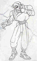
Here's an original drawn frame taken from Guy's stance animation alongside one of the finalized sprites actually used in game. Once again we see a case where the initial drawing is fairly simple compared to the final product. Guy's front leg has an implied line that is later used for shading but otherwise is much simpler in design than the final sprite. Looking at Guy's face shows that they did not even bother drawing his eyes properly as it would have been completely wrecked when scaled down to pixel size. Although the third image of the cycle suggests that his sprite stance is slightly wider in the final version, the key elements on the drawing match up well enough that it only would take some minor shifting to line up those elements just outside the line. The differences that can be seen support the idea that there is some post drawing adjustments done after the line work gets digitized. |
||
Note: First thing to note is that due to an oversight when setting up the gifs used for this section, the palette entries on the individual frames have skewed values that do not reflect the findings. As previously stated before, the CPS2 hardware is stated as having capabilities for a 32 bit palette. I suspect if this is the case, then they actively chose not to make full use of it. The max color on screen limit of 4096, which if multiplied by 16 equals 65536, the maximum limit available for a 16 bit palette. Considering my findings, I'm actually more inclined to believe that the fighting games using this style are all running only on 16 bit palettes.
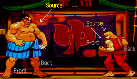
Of Light and Shadow - CPS2 Remix: On Honda's right arm, the upper part of his shoulder as well as his forearm are clearly lit as they are well within the view of the light source, while the bicep is in shadow as it is tucked inward and away from the source. Honda's stomach is an exception though, which I cannot think of a clear reason why except to keep it visually similar to many of his other sprites where he is more hunched over and the added shadow is justified. Regarding the second rule of lighting, limbs that are closer to the screen will receive more lighting than items further back in order to emphasize spatial distance. Honda's legs and Ken's arms work as examples of this. Ken's arms are more obvious examples, as his upper torso is clearly in front of his right arm making it illogical to give that arm the same bright shading as his left. Honda's legs would be more subtle in nature as there is no clear obstruction to indicate where they are posed. Therefore, his left leg is given a heavier set of shadows to show it is not on the same plane but further back. The same can be said for Honda's shoulders: his right shoulder has an extra light shade used as a highlight. The magic number is... 16? (Update: Or 17. 17 works too: See footnote)
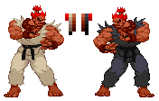
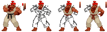
These first two examples of this quirk are taken from Street Fighter Zero 3: Cammy uses a full compliment of 16 colors, while Gouki clocks in at only 14, and technically his p1 color only has 13 unique colors. Both are using their Z-ISM palette entries. To elaborate on what I meant regarding the changes in value, I jotted down some notes from when I was initially trying to see if the palettes were actually entirely automated at some point. For these cases, I am starting from the lightest to darkest shades of Gouki's p1 and p2 gi colors and Cammy's leotard. The reason I chose these items are because both use the same number of overall palette entries which make them a fair comparison point. [Update] Actually, I may have found evidence that Gouki's sprites may in fact make use of the full 16 color limit. His V-ISM palettes appear to make full use of these colors, whereas his Z-ISM palettes do not. p1 Gouki gi: R changes G Changes B changes 64-48=16 64-48=16 80-48=32 48-32=16 48-32=16 48-32=16 32-16=16 32-16=16 32-16=16 16-0=16 16-0=16 16-0=16 p2 Gouki gi:
To ensure that this was not a game specific quirk, I checked for similar RGB values within other games utilizing this style such as X-Men COTA and the VS entries. I found that the same trend could be found in those titles too. One possible explanation given to me as to why this pattern exists is that it could have been for optimization purposes: a way for Capcom to streamline their palettes. Never Use a Pure Black Except for Very Rare Occasions:
Speaking of Blackheart, here's a frame from his stance animation to help illustrate the point. Although his color scheme is specifically made to leave much of him in shadow, his outline still manages to remain visible despite being on a perfectly black background. While with the exception of Marvel Super Heroes vs Street Fighter's training stage there would never be a background that is completely black, not using a pure black for anything major was a well planned and very deliberate decision on the Capcom artists' part to keep from there being too much visual confusion. This is not to say that they never use pure black though. you can find it being used within the darkest folds of Gouki's p1 gi colors for instance, as well as within the shadowed areas of Storm's uniform and cape. They basically work as accents rather than full colors in this respect. The important thing to remember is that if you must use a pure black shade for any reason, make sure it is not one of the predominant colors within the sprite. Update On Color Usage: It appears that while the general idea of there being a magic number is correct, Guild user sarifFIXIT brought to my attention something which I had overlooked when initially checking for a pattern; whether or not these values I had picked up remained consistent throughout multiple emulators. As it would turn out, comparing the color values obtained through Kawaks to values acquired from Final Burn Alpha and Mame fail to match up. The latter two examples actually would suggest that the magic number is actually 17 instead. This test was conducted by examining color values in SFZ3 A-ISM palettes for Ryu, Ken and Cammy to verify that these alternating values are consistent, indicating that there is still a pattern to adhere to, which appears to be the case. With this in mind, the adjusted values using this new information would look as follows: From 16 to 17 as magic number: 0 0 16 17 32 34 48 51 64 68 80 85 96 102 112 119 128 136 144 153 160 170 176 187 192 204 208 221 224 238 240 255 Guild user Felineki gives some additional explanation for these values found: The CPS2 colors are stored in a nibble-per-channel format. Each channel, Brightness (used for fading in/out), Red, Green, and Blue can have a value of 0-F. When you translate these to the standard one byte per channel format, you get the multiples of 17 sarifFIXIT mentioned. And it can display values of 0 and F(255). The darkest shade of Akuma's gi in SSF2T is pure black. Regardless of the exact magic number, these findings seem to still confirm that Capcom's method of palette adjustment was mostly done through multiplying values rather than random color selection. Whether or not this makes a significant difference when establishing a palette for personal work is a lot more clear cut though; as long as you maintain the pattern, you should be good to go in either regard; it may be somewhat tedious to adjust the values down the line, but switching from 16 to 17 is mostly a palette adjustment via batch process away.
|
||
From the Bottom Up: Putting these Lessons into Motion |
Starting with what we know:
As a side note for those interested in making Gouki related edits, you should always work with a non-p1 color for the reasons I already explained earlier in this study. It will just save you some work later on as you won't need to recolor bits to fix the darkest gi tone for other palettes. Also, if someone wishes to take this frame and flesh it out for use in a project, you would need to add some heft back to his arms, adjust the gi so it is more in line with the original cps2 design, and of course revert the belt and gloves back to the standard shoto uniform. Now with what we don't know:
Now Here's That Motion Part:
Here's a sample standing animation, and stand to crouch transition. These were animated within Graphics Gale, and the sprites themselves were broken up into various layers based on their positioning within the foreground, the middle ground, and the background. (Her hair in the back was layer 1, the main body was layer 2, and the arms were layer 3 in case you were wondering.) The rationale behind breaking up the sprites into layers is because it makes it easier to move or replace things as a whole. Imagine if it were all one image; when you move a part of a sprite like her back arm, that would leave a gap where the arm was that you would need to redraw. Doing this once or twice isn't bad, but having to repeat it for every frame would waste a lot of time. Also, you can always turn layers on and off to see what is below for redrawing purposes.
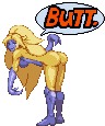
Not animated, but this sketch from Diepod's original character sheet was too funny to not sprite up. As for a conclusion for this study, that won't be as much a verbal one this time around as a project to work on; after all, you don't usually make standing and crouching animations for no reason. |