Feb 22: Other than layout change, nothing new here. Stay tuned for updates.
Introduction to my KOF Sprite Observations |
King of Fighters sprites adhere to a 16 color limit that has remained consistent from the original arcade titles on Neo Geo hardware to more recent ports of their games to home consoles. The light source used by SNK artists for this series comes from above and in front of the character at all times, although how various elements within a character's sprite is left to be handled at the artists' discretion. |
|
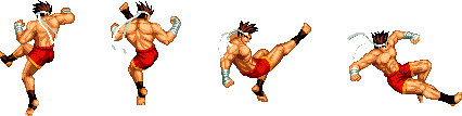
Up until the latest entry in the series which uses a higher resolution, most King of Fighters titles have used a standard sprite size and style. However, the exact nature of the style has changed over the years in a few ways for better or for worse. The first really big change was around '96 where many of the characters got new sets of sprites. Things remained mostly steady from there to 99-2000, but the style found in newer characters during the Eolith period and beyond started getting somewhat more loose in terms of detail and color distribution. To give a general idea of how things have changed up, let's take a look first at a character that's appeared in some form in multiple KOF titles, Geese Howard.
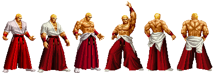
Geese first appeared in '96, so he came along with the first big set of sprite changes. In terms of his body, he's actually very angular in shape at this point, with a lot of straight lines being used in his clothing and stiff body posture overall. His skin tone doesn't use a lot of the darkest shade available except in fully defined areas like his chin and to separate fingers. The next sprite is the most common one, being the one used in 2k2/2k2UM and SvC, as well as home versions of XI and NGBC albeit with a modified palette that removes a skin tone change. His clothes and stance take on a more relaxed and natural look, incorporating more curves into the figure and fabric. His face has also been slimmed down and jaw reduced, and you'll find more use of the darkest skin tone as defining lines and in deep showed areas like his front hand's palm. The next sprite in the series hails from his appearance as a Striker in 2000. This is the first time within the series that he has appeared with his top down ala his Fatal Fury appearances. His hakama is a lot more ironed out in this showing, and for the first time there's an emphasis on his physique, with a lot of detail being placed on his upper body. In fact, this entry really is the first case of the sprite artists toying around with light and shadow treatment for Geese, as it's a lot more extreme here than in past examples. This version will become the template for later versions of topless Geese. I'll discuss the last 3 sprites together as they all come from the same 2k2UM HSDM. These frames are built around the 2k2/SvC set using the striker appearance as reference. Unfortunately, the artists who SNKP had for this task are really hit or miss as my examples show. The 4th frame comes from part of a reppuken animation, and shares quite a bit of the same anatomical details as the earlier example, and while it could stand to be polished some more to get rid of some kinks in the sprite work, it's acceptable. The last two frames seem to have been done without much reference on the other hand, and there is considerable proportion change going on here without explanation, and the shading and line quality has taken a hit on the upper body especially. The light source doesn't appear to be applied in the same fashion as the other sprites which makes them stand out even more. |
||
Geese Howard's evolution illustrates quite a few aspects of how the general KOF look has changed over the years, but he was not present during the original titles which means he doesn't fully represent the large changes that have taken place. Yuri on the other hand has been present for all these changes, and also represents a change in how SNKP illustrates their female characters.
Yuri's 1st sprite hails from the '94 era, and is the most rough version of the character. The contrast in items like her hair and pants are considerable, although her gi top is a bit hard to see due to the poor color choice. It's also fairly realistic in build, and honestly looks like something you might find in an '80s martial arts film. The next evolution gave Yuri a less compact stance, complete with visually longer limbs, improved shading on her gi, and a new and less dated haircut. Her pants are no longer as shiny, probably as a result of color usage being more needed elsewhere. Around 2003, The SNK Playmore artists started an interesting trend with the female characters. Some characters like Yuri and Mai had various sprites and animations redone, now taking on more of an anime aesthetic; eyes were made larger, skin tones lost a shade or two and contrast was changed giving things something more akin to cell shading, and some aspects of the body were changed proportionally or given more emphasis. In Yuri's case, the emphasis includes the reintroduction of her shiny pants, her hair getting larger, and her gi's shadows becoming more prominent, which helped to accent her bust. The comical part regarding this particular change to pre-existing female characters is that the artists who made the new material did not complete the change throughout the entire set of sprites. This means that one minute you could be looking at 2003 Yuri standing and walking about only for her to revert to her '96 self when attacking in some cases. |
||
Iori's evolution has been much slower compared to the more extreme example of Yuri. The '95, 2k2, and 2k3 examples are very similar in presentation,with the biggest changes being color based and some proportional adjustments here and there. the last two images belong to XI and NGBC respectively. Iori's look and shading has been simplified somewhat, with the level of simplification being much more extreme in NGBC's case, where his colors are a lot more flattened and contrasting than the other sprites here. (Thanks to Anjel for creating this collage of sprites.) |
||
Like I have suggested up to this point, at some point after 2000, there was a trend towards the newer sprite work becoming fast and loose, and some pretty rough stuff got into the final products as a result. Quite a few of these images were posted publicly rather than of my own creation, so I'd like to take the time to thank Walt and KOD for setting up this material to explain a few things I've noticed.
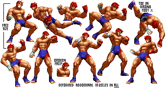
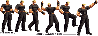
Gai Tendou is a great example of what slips through the cracks thanks to the frames being shown in a generally quick fashion. His physique seems to change considerably from one animation to the next, with detail in his arms, legs and abdomen changing size on a frequent basis. His skull size also changes quite often, as the example frames on the left show. A few questionable frames can be expected with fluid sets, but the mess is rampant in Gai's frames.
This particular entry comes from KOF '98UM, and is Joe's Pressure Knee attack. The most glaring problem is quite obvious in that it doesn't really match any form of KOF shading to date, much less blend in with the '96 revision. Provided are the individual frames and the move in motion. The new frames at the end stand out like a sore thumb.
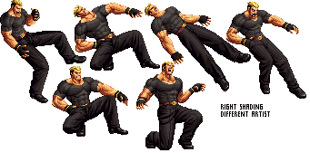
Yamazaki here got a sprite update in 2k3, which predates Gai. He does share some of the same issues though, primarily with the questionable abdominal muscles which are more stylized than anything. The strangest thing regarding this is that within the same redone set, you can also find examples of more realistic muscle definition. I have to agree with Walt here; there's little chance that the same person made both sets of sprites.
|
||
A Look at Things to Come: XII and Beyond |
With XIII and the conclusion of the Ash Crimson saga being announced, I figured this was as good a time as any to take a quick glance at the style introduced in the incomplete mess that was XII. Let's look at one of the members of the returning Women's Team, King.
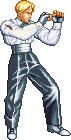
Stepping back for a minute, this look isn't quite that new, as it's actually a callback to her original appearance in the Art of Fighting series with some minor cosmetic changes like the color of her clothes being changed and the much more prominent chest. Let me put that up below, along with her '97 stance for good measure.
King stopped trying to pass off as a man years back, but seems to have liked the look enough to update it for the current age. As you can see, it even still has that clasp or handle on her sleeve just like the original look, only it isn't quite as easy to see on her current sticks that are supposed to pass off as arms... To add to my previous list, her clothes are a lot more form fitting now. Aside from the whole stylistic arm mess, not too shabby. |
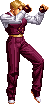
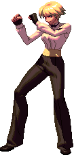 Hey there King, looking a little different than what I remember. Your jacket seems to have taken a vacation this time around for one. Looks like you did something new with your hair as well, although that might just be the new style's doing...Oh yeah, since when where your breasts so accented? Normally that's something more reserved for Mai, otherwise known as the fan service of the group.