An Argument against "Feature Creep"
Example of Going Too Far: KOF Nests Conclusion
Random Things to Avoid
Back to Index
Back to Sprite Discussion |
An Argument against "Feature Creep"
Back to Top
|
Every conventional fighting game, or any game for that matter, has its own set of systems and features which contribute to the overall game play experience. The trick is to find a happy balance between having enough going on to keep the game play from being too plain yet not so much that it becomes overly convoluted and a hassle for the player to remember everything important. Equally important is that what you do include must be able to mesh together well with one another. For a commercial example, Street Fighter 4 has the Saving Attack feature and Revenge Bar system. The Saving Attack can be used to negate one hit from the opponent in most cases and allow you to counterattack and begin an offensive of your own. The Revenge Bar builds up based on the damage your character receives and opens up the opportunity of a fairly powerful Ultra combo attack to try and pull an upset victory later on. These two systems work fairly well side by side, although one can argue that the much more frequently available Ultra combo attack renders the more conventional Super combo attack somewhat pointless. The point is that the number of overall systems is still easy to keep track of and doesn't weigh the game down.
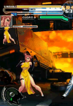 This particular image taken from a video I witnessed regarding a work in progress for the Mugen engine does quite the opposite of keeping things simple. In case you can't quite make out all of the different things going on here, this character has a stamina bar that drains when the character attacks, Street Fighter Zero 3's Guard bar mechanics, Street Fighter 3's stun system, an animated portrait system borrowed from the Guilty Gear X series, and lastly the Revenge bar from Street Fighter 4. This particular image taken from a video I witnessed regarding a work in progress for the Mugen engine does quite the opposite of keeping things simple. In case you can't quite make out all of the different things going on here, this character has a stamina bar that drains when the character attacks, Street Fighter Zero 3's Guard bar mechanics, Street Fighter 3's stun system, an animated portrait system borrowed from the Guilty Gear X series, and lastly the Revenge bar from Street Fighter 4.
Let's just give a quick comparison to what the character's native game play system had off the top of my head: multiple levels of super power, a reflector system that behaves similarly to SF3's parry system but accessible via a single button press. While I did not see the reflector system being used in the video I've taken this screen capture from so I can't be sure if it isn't also in this work, that still means that this character has quite a few things going on at once. Is all of it generally useful? You can argue that all except the graphic only portrait do contribute to game play. All of these items have been shown to work in their respective titles, but you normally don't see them all in one place as it is a bit heavy-handed. I could see guard,stun, and revenge bar systems working together fine personally, or a few different combinations of some of these still being reasonable, but this is just too much as a whole.
A second aspect to consider is that with all of these elements being visible, it makes that half of the screen very visually busy. Surely it could be possible to either make some subtle visual cues for things like the stun meter. Street Fighter Zero 3 has both a stun meter and guard meter, with the former being mostly invisible. If you hit or get hit enough you are reminded that it is there, but it is running in the background. Visual things like the portrait aren't necessarily bad despite having no practical use, but the source games this idea hails from also have little clutter going on everywhere else that allows for this sort of thing to work.
To sum up my overall message here, try to keep system features to just what you need or find useful, and if it starts to add up at least make sure it doesn't take up too much visual space. The screen should be focused on the two or more people trying to beat each other up, not the people navigating between a series of excessive bars and icons!
[Update] It appears that the character has now been released, so it's a good time to take a look back at this example to see just how much overkill really is present here.
- The SFF has 1509 sprites all together, with only 389 actually being the character herself. The rest is made up of system bars and special effects from a range of sources.
- Virtually everything runs off the stamina system somehow, including basic movement in the form of dashing backwards and forwards. Even taunts take a considerable amount of stamina, despite not really having any practical use or reason to.
- Explanation given for some of the odd quirks surrounding her game play or lack of: the character is meant to be based more so in reality so some laws of reality should apply. On its own, might not have been too bad of an idea but with how it has been applied it renders the character less enjoyable to play as. Quite a number of disadvantages in a fictional realm where people can throw balls of fire or lightning at others and regularly scoff at the idea of gravity.
- How the game play was over conceptualized? You have elements from various games (SF3, SF4, MK, ABK, GGX, MOTW, BBB, etc) are mashed together. While you could certainly get away with combining some of the elements together as they compliment each other, it's really just too busy here. When right in front of the opponent, Marilyn Sue abruptly stops and is unable to advance forward any further. This was done intentionally, but is awkward in actual practice. Stun and guard gauges were made to suit characters designed exactly like her only, leaving her disadvantaged in a global environment.
- While not related to gameplay, it's interesting to note that in the character's folder, the majority of the character files are concealed in hidden folders to try and prevent others from reading into them or tampering. It was necessary on my own part to remove all that absurdity to get the character to load properly. It also revealed that the file size for this thing was very substancial, clocking in over 50 megs.
The long and short of it is that quite a few of my earlier concerns turn out to be well founded. While I'm already here though, let me list off a few possible combinations of elements that work s well as some that don't.
- Guard and Stun meter: Both are defensive features that don't interfere with each other, and punish poor play via either blocking non stop or blocking your opponent's attacks exclusively with your face.
- Guard, Stun, Revenge meter: This is basically an SF4 setup, so you've got a commercial example to look at for ideas of how you can go about balancing things.
- Stamina and Charging: If done like the Big Bang Beat model where only specials and some advanced movements drain the bar, this is a pretty fair combination. Everything taking power will just get tedious as you'll need to be charging constantly to keep from running dry every few seconds.
- Just Defense and Parry: This is not a good example in most cases, especially if the timing window is lenient. It's fine to have one or the other, but there is no need to have both available as once due to balance issues. You basically give the player too many outs when both are available.
- Custom Combo and Charging: Unless the charging rate is very poor, this will become overpowered in a hurry. While charging could be considered excessive in many cases, making it possible to build up power quickly for a temporary boost in chainability is a bad idea.
|
| |
Example of Going Too Far: KOF Nests Conclusion
Back to Top |
The earlier example shows an example of too much going on at once, especially for a work that's meant to be used in a global fashion. If you have something that that is meant to be a stand-alone project that surrounds itself with equally equipped work, then you get a lot more leeway in what you can get away with. As long as everyone's playing by the same rules, it tends to work out better. In this case, let's take a look at a project that's been underway for quite some time by a fellow who goes by the name of RedNavi, KOF Nests Conclusion. This project is a fan-based take on a King of Fighters entry that runs off the Mugen engine.
As the title of this suggestion suggests, there's a bit of overkill going on there, but there's some interesting stuff going on in that project on a conceptual scale. Rather than using many of the engine's already built in assets, RedNavi seems to have remade a number of them within the characters' code themselves (I would at least assume as much from screen shots and videos; the only playable character shown up to this point is K') and made equivalent versions of SNK Playmore's pause menu functions such as being able to view move sets, adjust training features, etc.
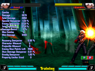 In the current build's training mode, it's possible to view various bits of data such as damage done by an attack or overall combo, level of damage dampening, and stun points left for the opponent. It's actually more data than you would receive from even the official titles, bordering on overload perhaps. In the current build's training mode, it's possible to view various bits of data such as damage done by an attack or overall combo, level of damage dampening, and stun points left for the opponent. It's actually more data than you would receive from even the official titles, bordering on overload perhaps.
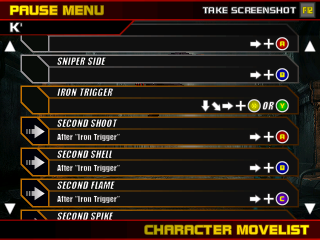 Here's the pause menu equivalent of the character move list. Once again, it's done along the lines of what you would see in the commercial KOF titles, only you are just scrolling up and down in this case as the move set isn't broken up into multiple sections such as command moves, specials, and DMs/SDMs/etc. Here's the pause menu equivalent of the character move list. Once again, it's done along the lines of what you would see in the commercial KOF titles, only you are just scrolling up and down in this case as the move set isn't broken up into multiple sections such as command moves, specials, and DMs/SDMs/etc.
I find it a bit funny though that the upper right corner informs you that you can take screen shots by hitting the F12 key. While it's nice to know that hitting that key can take screen shots for you, it seems a bit silly to mention you can take screen shots of the move list, as I can probably assume that there will be a regular text version of this list to refer to outside of the game as well.
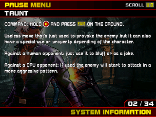 Alright, now we are starting to get a little silly here. In addition to the move list, there is also a way to read about various game play mechanics in game. Once again this is to give it more of a sense of a commercial product and I concede that the particular example of this informational screen does have some use. I'm still leaning towards this maybe being a bit much for something that can be viewed in the middle of battle, and better reserved for a regular text based format outside of the file: if you really want to keep it fancy though, you could make a pdf file that acts as an instructional manual though... which is an idea I may end up using myself down the line. Alright, now we are starting to get a little silly here. In addition to the move list, there is also a way to read about various game play mechanics in game. Once again this is to give it more of a sense of a commercial product and I concede that the particular example of this informational screen does have some use. I'm still leaning towards this maybe being a bit much for something that can be viewed in the middle of battle, and better reserved for a regular text based format outside of the file: if you really want to keep it fancy though, you could make a pdf file that acts as an instructional manual though... which is an idea I may end up using myself down the line.
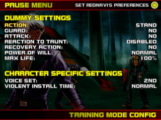 Okay, dummy settings like what's available in the standard training mode but clearly this is also built in as it includes customized items that don't appear in the standard training mode. I can only guess at what power of will is supposed to actually be, but I'd wager it being the equivalent to the standard power value. Okay, dummy settings like what's available in the standard training mode but clearly this is also built in as it includes customized items that don't appear in the standard training mode. I can only guess at what power of will is supposed to actually be, but I'd wager it being the equivalent to the standard power value.
What is throwing me for a bit of a loop here is that in addition to dummy settings, there are character specific settings that can be changed real time. For K', it's the ability to change the voice set used and the time for one of his customized DMs to run. (Violent Install seems to be something pilfered from Guilty Gear's Sol Badguy just for clarification.)
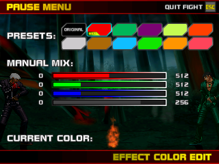 Okay, now we've gone too far for sure: this screen shows that you can edit the colors for a characters effect while still in mid battle. It's possible to choose from a number of preset colors or to manually adjust it while the action is paused, with a sample of what it will look like showing at the bottom of the screen. Really, this is a bit much to say the least. I can understand the vast majority of the above as there are some practical uses for those items, but this menu option is just flashy and excessive. It's novel, but not really useful. Okay, now we've gone too far for sure: this screen shows that you can edit the colors for a characters effect while still in mid battle. It's possible to choose from a number of preset colors or to manually adjust it while the action is paused, with a sample of what it will look like showing at the bottom of the screen. Really, this is a bit much to say the least. I can understand the vast majority of the above as there are some practical uses for those items, but this menu option is just flashy and excessive. It's novel, but not really useful.
For those who want to see a number of these things in action, RedNavi does show these items off in the following video here: just be forewarned that the video volume is a bit on the high side. |
| |
Random Things to Avoid
Back to Top
|
- Just because you can make a character with grooves based on various different games doesn't make it a good idea. This doesn't just come from the player's standpoint of it leading to overkill, but also from the programmer's standpoint that you'll have a lot of extra things to calculate if you want to make sure everything runs right. And there there are the number of variables that you'll likely need to use. The horror... the horror...
- No, your character does not need a thousand and one effects going off one after another or at the same time. Also, if I can't see your character for seconds at a time because of all the effects in the way, you are overdoing it by far.
- Try to keep the screen clutter-free of extra things like bars that take up a lot of screen space. These sorts of things should be off to the side or bottom and not blocking up the main action areas of the screen.
- Regarding my own view on power stock management, the rate at which power gets built up should reflect their original game source if taken from a commercial title, or at least some reasonable measure should be worked out depending on the effectiveness of the super moves available if original. While this one is a bit more subjective, one thing you should steer away from is giving a character the ability to very quickly build up meter for super moves that damage a lot multiple times during the match.
- If you're going to change the values for life, power, attack and defense to more extreme values, it better be done for legitimate reasons. There are few justifications for a character having 2000 life or above, or having access to excessive power stocks.
- Projectile spamming should be frowned upon, especially if it can be done to the point where the opponent literally is locked down and unable to retaliate at all. You can often find examples of this in characters based off the various Touhou fighter titles where many of the characters are projectile heavy. Why does it work there? The games often have some game play elements that balances things out enough to make it playable which aren't brought into later conversions of them.
- Keep your visuals consistent: avoid using effects from game A along with stuff from game B if they don't really resemble each other. It usually just comes off clashing visually, so you are better off using materials from one source only when available, or if you insist on using stuff from elsewhere seriously try to convert the outside stuff to better resemble what you already have.
- Not every character needs a God, Evil, Orochi, or "Shin" version. What usually happens when people decide to build around these concepts is that they just make a mess of a character that is excessively flashy without real substance, has wonky values for things like life and power, and can juggle things to oblivion to the extent that they can kill things several times over. Particularly offensive is when these are applied to characters that don't even make sense... actually, the most offensive may be the use of "Shin" here as it is just the word for true in Japanese. This makes things like the "Shin Level 2" stuff borrowed from some over the top flash animations particularly silly. If they wanted to have something that told the truth, they should really sell themselves as things like "Mismatching gi color Ken" or "Oddly Dressed Gouki with Facial Hair."
- While this should probably go under the sprite section of the site, let the record state that resizing a low resolution graphic and throwing a Photoshop filter or two over it does not make it a high resolution graphic. It just looks blurry, and most times worse than the original as you have destroyed detail with the filtering. For those who may retort that resizing and blurring of effects looks fine in many cases, I would remind you that most effects are far less complicated than character sprites, and the screen time they get is far shorter than a character's usual animations so you don't really get a good look at them in action and see them for what they are.
|

