
Nov 24: First draft of Animation Study now publically available.
From Start to Finish: My Working Process In Depth Studies:
|
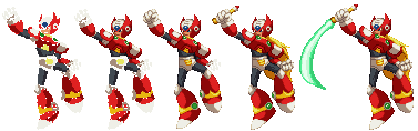
I've tried quite a few different things, but this is the usual way I end up working on my scratch sprite work in more recent times. I normally only keep the final versions of sprites, but thankfully Walt happened to keep several progressions of this particular Zero sprite handy for me to reference here:
I start off with making a really rough version of the sprite by drawing it up with my old trusty Wacom Graphire3 to general proportions of what the finished sprite should be, and some idea of how the light source should be handled. The first sketch usually takes a few minutes, with this one being around 10, as I was fidgeting with arm placements and angles of the legs. Once I'm happy, I then start detailing the head and upper torso to get a feel of things, and start working my way out from there. While these parts of being fleshed out, I am also fixing up proportion issues throughout; Zero is no different, as the progression shots show that I'm correcting his lanky limbs and torso constantly, in addition to moving around his leg placement still to better fit his hips. Once most of the body is down, (image 3) I really begin fine-tuning the various details to get the sprite as perfect as I can. Zero's chest section has been touched up, his shoulder pads are made bigger in parts to match up with each other, and I have stuck in his Z-Sabre handle. The last sprite shows some more adjustments in limb length and detail fixes, and now includes the blade swipe itself, which was drawn in by tablet and touched up by mouse to smoothen the curve. The gif shows the overall process in motion. |
|
Color limits:Most of the older commercial sprites maintain a 16 color limit; 15 actual colors, and one for transparency. Examples of fighting games which adhere to this limit are the SF2 and SFA titles, The KOF series, and the two CVS games. While this isn't a major concern when it comes to creating material for the Mugen engine, as act files allow up to 256 colors and effects can maintain their own palettes if assigned properly, it's still an interesting and worthwhile experience to work within the old formats and limits. Here's one example I worked up some months ago:
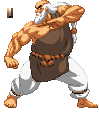
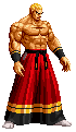
In terms of line work, these two Gouken sprites are the same. The first image uses a non-standard amount of colors, as it has been separated into various tones for each major item such as skin, hair, clothing, etc. The second sprite obeys the standard 16 color limit in many games. To achieve this, his hair and pants now use the same basic color set. Color values have also been altered to increase contrast, which help the sprite fit in a bit better with commercial sprites that utilize what is referred to as CvS style. CPS3 shading:When this new set of hardware came out, so did a new limit on just how many colors could really be used. The sprite work in the SF3 titles and Red Earth now started using anywhere from 30-60+ colors per frame. These new limits allowed for much more creative uses of shading than what the old hardware could provide, especially when it comes to shadows. Trying to figure the rhyme and reason here, I studied over SF3's frames, and worked out this study of cps3 shading using color references from Ibuki's frames and line art from an official SF3 art book.
The lit areas and shadowed areas tend to use roughly the same amount of colors, being somewhere between 5-7 shades from my last check. There aren't too many hard lines present, even around the edges. In the examples I've seen, the shadowed areas tend to use cooler colors than the lit portions of a sprite, with Ibuki's skin taking on purple tones in this case. The explanation behind this second set of colors is probably connected to natural light reflection; unless the case is extreme, even areas not in direct sunlight receive remain partially illuminated due to their surroundings and light's tendency to bounce. Sadly, the only suggestion I can give in terms of deciding on color shades to use when making your own sprites is to look at the commercial examples to get a better gist of what you should be looking for. Anatomy:Due to my educational background, I always take an extra hard look when it comes to anatomy. I always keep a few anatomy books on hand, and if left to my own devices I could honestly fuss over details for hours on end until I am mostly satisfied. It's always a fun time trying to mimic a certain style while keeping some aspect of realistic body structure intact. Capcom anatomy is always exaggerated in some way, with exaggerated muscle mass and enlarged hands and feet often being present, not to mention things like Chun-Li's thighs! Although some of the newer additions are a bit shaky in terms of sprite work, the KOF series tends to be a decent place to find something a bit closer to normal anatomical proportions.
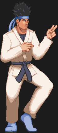
This Geese frame is an edit of his '96 set, but uses the same level of detail you could find on official sprites by SNK's artists. It's said that the process used for creating the character frames is much like the ones for the XII game, which involved using 3d models to create a base to be drawn over. The models must have been fairly detailed to begin with, as most of the surface anatomy to be expected is accounted for and done with fairly reliable detail where possible, which is part of the reason I like the style used in those games. Of course like any sprites at this scale, you only have so much space to work with to fit in this sort of detail, so you really need to be picky with how much detail you put into the sprite without overdoing it. In my example image here, the arms and upper torso are mostly fine for the style, but the abdominal area probably should be simplified a bit, and the abs themselves are a bit wonky due to symmetry issues. Geese's right arm could also probably be adjusted to soften the solid dark line in his forearm, which was a leftover from the original sprite. For suggestions on anatomy, I would suggest investing in anatomy books on your own or even signing up for live art drawing classes if you can swing it. There's no better way to learn than to observe from the real thing; photos are an okay substitute, but are rarely ideal in subject matter and lack the perspective that a true model in the round can provide. Light Source:Shading within a sprite depends on where the source of illumination. The areas that are more exposed to where the light is coming from will have brighter shades of color, and the shades will gradually get darker the more removed they are from said illumination.
The CvS example has a light source that is strictly above the character at all times. Notable about this style is the considerable increase of contrast when shifting from illuminated areas to shadowed parts. Gouken's pants and skin tone are the most clear cut examples in this image; the brightest shade and dominant shadowed one are considerably different from one another. There exists a middle shade between these extremes that acts as a way to blend the two together. This middle shade is rarely thicker than a pixel or two, and is used selectively compared to the 1st and 3rd shades. |
||
It may be pretty obvious to some of you, but when you're working on sprites using a particular style, it actually helps to have a bunch of samples of sprites in that style for referring to things like proportions, shading, and color use. To be a bit more specific there, you should be looking at official examples when possible; while some fan based edits do a really nice job of making something that looks like the style, it does not mean that they are playing with the same set of rules; a lot of CvS styled sprites actually go over the color limit, or are basically resized and reshaded versions of CPS2and KOF sprites.
What may not be as obvious is that another way to get a feel for a style of work or a specific character is to find official art on them. What I am suggesting is that if you can afford to, pick up some related art books. For Capcom and some SNK series, there are actually quite a few different books available either via import or domestically. Referring to Capcom books in specific (mostly because those are the ones I have most of) The Capcom Design Works set covers art for a a bunch of different games, while there are a handful of series specific books like SF20: the Art of Street Fighter, Darkstalkers Graphic File, and R20: Rockman 20th Anniversary. Some of these books are available online as scans, but I always prefer to have a physical copy handy. Just be aware that if you share my sentiments, some of these books tend to cost more if they have to be imported like the Design Works volumes. Udon Entertainment has actually been translating the more recent books for North American audiences. I'd say from the books distributed by them that they have been doing a decent job... aside from some of the painfully long delays certain titles have gotten. I'm looking at you, Darkstalkers Graphics file and recently delayed R20 translation! |
||
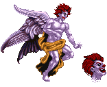
This particular image was spawned from a set of you tube videos I saw which involve a merging of the Final Fantasy villain Kefka and McDonald's mascot. The images in the video used photo realistic imagery though rather than actual sprites, and I felt a real sprite version needed to exist somewhere. I looked up the original Kefka image and started spriting spriting up Ronald's body from scratch, but the wings are the original frames as I have yet to redraw them in a way that would make it easier to animate later if desired. I also made a disembodied head to mimic the one used during the 'Goner' attack in game.
Something I find funny is that a handful of people have actually expressed that they find it strange that KFM's eyes are actually visible now. I always figured that part of the reason why they were never originally shown was because of space constraints on the actual sprites themselves plus the fact that Elecbyte didn't seem to have a dedicated sprite artist on hand. |
||
|
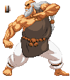
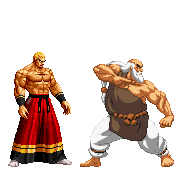 The two examples here show the typical light sources used for Neo Geo era KOF sprites and CvS era sprites. (While this Gouken example and most of my similar works use a modified version of that style, they maintain the same general rules, so the facts here still apply.) The light source for KOF sprites tends to come from above and in front of the character. Geese's head and upper body are well lit as they are in plain sight, and the shades get subsequently darker and features become more obscure the further you move around his figure. (His arms get darker the further back you go for example.)
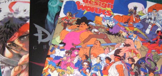
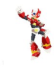
 Here's my own take on what a higher resolution Kung Fu Man would look like. This sprite was brought on by the recently updated Mugen builds, which now allow for wide screen and HD output. The current example version of KFM HD though is a filtered version of his small sprites, which are a little rough around the edges to be frank, as filters really can't do the job.