
Feb 22: Introduction revised.
Introduction to my SF2HD Sprite Observations |
Before I even get started on the intro proper, you will probably notice that this page of the site uses dimensions that differ from every other page. Due to the size of the frames being discussed, I feel it's necessary to expand the template a bit to be able to properly show the images along with my text. Also, I'd like to thank some people in advance: Freezeman for figuring out how to acquire these frames, and Shoshingo for converting a number of the images used on this page for reference. Where to begin here... this downloadable title was primarily sold as an updated version of the classic SSF2X title that in addition to various game play tweaks to balance out the roster also played on the fact that the graphics had been redrawn into what is considered high definition standards. Commercially and critically, the game can be considered a success for Capcom. In terms of art quality, it's a total mess. Here's the back story about the art side of the project: the Toronto-based art studio Udon Entertainment was brought into the project to help with the transition of upgrading the old cps1 frames into the larger, more detailed resolution desired for this title. Just to put my opinion out there, I actually like Udon's work for the most part, but their anatomical work on occasion is exaggerated even by Capcom standards. If they were the primary people working on the project, I feel it would still possibly work out decently. This was not the case though. Udon was involved in upgrading sprite work, but later discussion would reveal they were more on the consultant end of things and that a 3rd party was responsible for the brunt of the work. This 3rd party unfortunately was not up to the job, with the various reasons why to become more apparent as I go further into the sprites themselves. [Update] I actually have an update regarding Udon's involvement in the game; by chance in late 2010 I was able to ask Project Manager Jim Zubkavich a few questions about the project which confirmed and expanded on a few things. As I've brought up before, he confirmed that Udon's roll was mostly a consulting one, with them being behind concept illustrations and refining some key frames but not entirely hands on when it came to the animating itself. What I had not been previously aware of was that there was more than one 3rd party animator; there was at least one studio that was working on the project prior to the one that finished the job which was removed due to quality issues. Considering some of the things that can still be found within the final sets of sprites, that is a fairly scary thought of what they originally were dealing with. As you can imagine, this also must have put a strain on the game's timeline and budget.
|
|
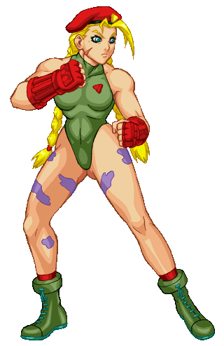
Alright, let's start with one of the New Challengers, Cammy.
This is her stance animation as it appears in the game. You might be noticing first of all that it looks a bit choppy in motion. This was a programming decision on Capcom's part to preserve the original frame counts from the original cps1 title as to keep the overall download size smaller to fit within console online services' size limitations as well as not potentially change the original title's game play with altered animation timings to fit new frames in. So this sort of choppy frame rate will be par for the course. You don't really notice it too much in the original title, but the jerky nature starts to stand out at larger sizes like this. Okay, let's move onto how Cammy's shading was handled. The shading is mostly based on the original, but the people who revamped these frames seem to have taken things a bit too literally without considerations of what would look proper at this scale. Starting around the top, the light source around her collarbone is bouncing all over the place. I would have guessed that it had something to do with her hair bouncing, but from the general light source used it really shouldn't be affected that much. On the other hand, the shading on her breasts do not really change at all. Now with the bounce there, you'd expect that there would be at least some increase of shadow along the bottom with downward momentum, but I guess not. Moving further downward, the lighting around Cammy's abdomen and pelvic area actually narrows for a single frame during the animation. Okay, I can understand what they are actually implying for the ab region, as the contraction there could be from breathing. Why is her crotch lighting changing in the same rapid fashion? Why do I even have to seriously ask about crotch shading in the first place? Goddamn. Okay, now to the legs. You've got pixels that need cleaning just outside of her hips, most noticeable on the artist's left. Speaking of left, Cammy's left leg is supposed to have an implied bend in this animation, but it looks like all the inbetweener did was change the shading on that part. Same for the boot on that same section but also adding a bit of extra sole of the boot to cover it up a bit.
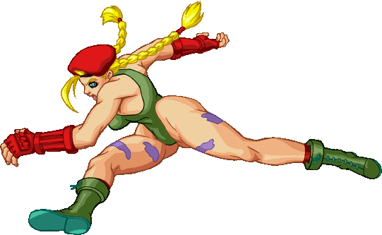
Moving on, here's a frame taken from one of Cammy's jumping basics. This is a case where the artists responsible just didn't seem to bother making a few small changes that would make the image much more sensible. Cammy's left hand seems to be a smidge dislocated around the wrist, but it could be worse. Her right leg's foreshortening could stand some improvement but it is passable. Wait, just what is going on around her hips and torso? This can't be right somehow... The foreshortening isn't working well here, causing it to look like her torso is even smaller than usual and that her pelvis has gotten a few sizes bigger from the stance animation. The anatomy around her crotch just isn't sitting well with me for some reason. Maybe it's the implied shading which once again seems off considering the pose, perhaps the one random lighter spot of color where it doesn't belong, or the fact that the line work that connects her hips to her legs just doesn't look right. Just what is it with Cammy's sprites and issues involving her crotch? Okay, there's just no way I can save this part of the study, moving on... |
||
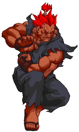
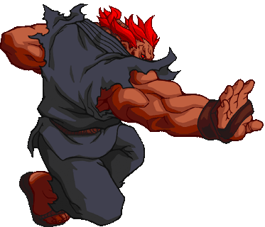
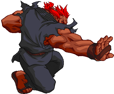
Moving onto the 3rd of the gi-wearing head swap characters, Gouki this time around gets his own unique sprites. What does this mean for him? It means that the assorted artists responsible for his frames give him an absurd upper body even by Capcom standards. Let's proceed with frames taken from his zankuu hadouken.
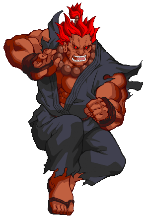
Okay, here is the first two frames of the animation. Okay, we have the game's cheap hidden boss starting to wind up to toss his projectile. Jaw line is pretty pointy at this juncture, and I'm pretty sure that he'd he hard-pressed to strain any more veins in his forehead. Left arm shading doesn't seem quite logical, as you'd think there would be more shadow around the areas outside of the the light source affected regions but at least it's no Cammy-crotch. To frame number 2: Gouki's head has shrunk a bit from the first frame, even though with his mouth open like that it should be roughly the same. I guess his jaw just randomly shrinks from time to time. Moving downward the shading on his right hand is now being treated in a new manner, despite a minimal change... wait, that's probably because the fingers in this new frame are drawn really poorly and fat this time around. Must be to balance things out his with other hand, which rather than getting larger as it should has shrunk to spite the concept of foreshortening. Also, if you noticed that part of the torn gi on his left shoulder looks cropped off, it's because it was like that in the frames themselves.
Wait, what's going on now in frames 3 and 4? Gouki's legs actually have shrunk from the initial frames of this same animation, and frame 4 is actually larger in scale than frame 3. Shading changes up as well over the two frames all over the place. Left arm changes noticeable in scale, and his right arm does the same on top of a large shading change. Legs both gain and lose shadows in parts. Same can be said for the gi and Gouki's hair. I know that one of this frames is supposed to be the one where the projectile is actually thrown, but the shading changes don't reflect what would be the introduction of a new light source around the hand properly. |
||
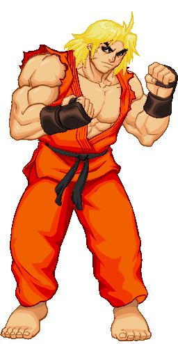
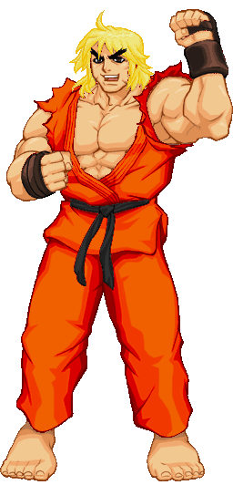
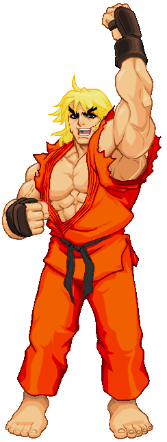
Alright, maybe it would be best to break down what is a fairly stationary pose in the hope of some improvement. Let's look at the second shoto of the series, Ken Masters. Here he is posing after just having won the round. There are a couple of things here that are bugging me. First you have some minor things, like the edges have stray pixels outside of the outlines on Ken's arms on all frames, and the gi colors which are invading his face and hair. Then we go to randomly growing and shrinking body parts. Ken's right arm changes scale in each and every frame in ways which don't quite work with the perspective change, and his hand grows from the 2nd to 3rd frame and actually breaks along the way. Ken's left arm just keeps on growing in the animation with the last frame being much larger than the rest. The black belt gets longer only to become shorter again, the gi top seems to not loosen but turn itself inside out that isn't reflected in the part of the same top below the belt, and frame 3's cheat is starting to expand much like the left arm to critical mass.
|
||
Okay, I could technically have another study on some Fei Long frames I have from one of his win poses, but I feel there is one frame that covers a lot of it at once, plus I'd also like to showcase some other characters at the same time.
Here's a frame from his other win pose where he is shaking about yelling. First of all, our Bruce Lee clone here has clearly gone insane. I know the original pose has an intense expression to it, but this is not what those frames was showing! That gaping expression which looks like a psychotic smile of sorts definitely was not present in the classic frames, and the now visibly shaken hair is not helping any defense arguments on the martial artist's sanity. (Mind you, the hair being shaken up a bit actually does make sense in this case, so it looks like someone brought some sense to at least part of the image.) I think I understand why though. He's clearly lost it over his nipple upgrades. He did actually have them in his original frames (a bit of a rarity when it comes to Capcom sprites) but they were much more subtle than you can find in these revamped frames that has them outlined with the darkest skin shade they have. Speaking of shading, I'm not quite sure what's going on with the left half of Fei's body here. It's noticeably in shadow now especially along the pants, even though the leg position is supposed to have them at around the same level. The original frame did have that half of the body slightly darker, but the key word here is slight.
I think I'm going to start off on a nice note with the face here. I'm actually going to say I like how the artist's handled it in this case, even if the jaw along the back is a tad large. All in all, not too bad. The back is another story. I wish I could tell you what was exactly going on there, but I can't even identify everything I'm seeing in that general area. The further you go into his lower back, the more you descend into madness. The shades of orange and red on the pants get harder to see clearly as you get into the darker shades Not too bad of a problem to fix, except that it seems the last shade is actually tied to Dee Jay's skin colors which would mean changing one also affects the other in some way.
The silly part about this particular setup is that you know that if Ryu's frames have errors, they are also going to pop up in Ken's frames. (Gouki has a different build in this game, so he gets his own unique set of graphical mistakes.) When from the early progress drawings shown online, Capcom made it apparent that the frames done for the first shoto were being recycled for the training partner. In all of those original drawings, both Ryu and Ken were seen in white gi uniforms and dark brown gloves for a reason; Capcom had taken this practice into the high definition realm! Here's another note of interest: notice how the transition from one color to the next appears a tad fuzzy? That's because rather than arranging things neatly to a reasonable set of colors, the artists for this game lightly smoothed over the rough edges to give the sense of anti-aliasing but without making the palettes manageable. The color counts range greatly from frame to frame, but the overall color usages surpass 200 colors due to this haphazard way of blending things together. It just seems strange that they would redraw everything just to make a mess of it with a quick fix like this in the end... |
 Okay, now going to pick on the 3rd new challenger (I did not realize that a lot of the reference frames I had collected were actually of them) Dee Jay.
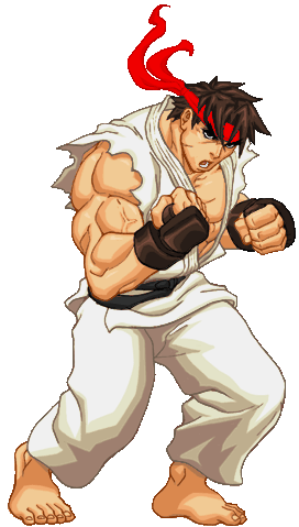 What the hell are you staring at the players for? Your opponent is in front of you, not to your right! As for what's going on with your left foot, I don't even want to guess what happened that resulted in it becoming deformed like that. Speaking of things that just look off, Ryu's left tricep seems to have an additional fold in there that doesn't quite add up. I'm just going to have to chalk this one up to overdone anatomy gone too far yet again...