
Feb 22: Other than layout change, nothing new here. Stay tuned for updates.
Introduction to my XII Sprite Observations |
To continue my study on the sprite work that can be found within the King of Fighters series, I feel enough time has passed to be able to take a proper look at the new artistic approach that was introduced in the latest entries into the series. I'm going to assume you've already read through my previous study covering the series from the first entry to XI and the Ultimate Match entries. To sum things up for the most part, that period consisted of rendered figures that for the most part have a greater basis in realism than what you could find in Capcom titles, although the later entries would not adhere as closely in this regard and was moving its focus towards dynamic motion. As much as I would like to poke at work like Angel and Gai Tendou, there is a certain impact and sense of life within their animations. The original titles were actually rather stiff in their movements in comparison. The newest games are now using taking advantage of the larger resolutions possible with current generation technology, and thus the series has undergone a visual revamp that completely changes the look and feel of the game to something that is a bit of a blend of Capcom's visuals at a scale comparable to Guilty Gear X games. When playing King of Fighters XII though, the sprites would appear to be at a larger resolution though, as the game would zoom in and out in accordance to how far apart the fighters were on screen. SNK Playmore actually did something very nice for this entry by creating a special site that shows samples of the game's sprite work, and even shows how they went about making it. While it is entirely in Japanese, I would suggest that you visit the 2D Dot Graphics Gallery to see these things with your own eyes.
|
|
Regarding the type of changes that some of the characters have undertaken, I think the Ikari Warriors serve as a fairly good example of how some of the characters had their designs changed up for these new entries. In a lot of the cases, characters kept their classic designs for the most part, but seem to gain some extra muscle. Scans of early versions of the sprites reveal that these two were to be given similar treatment at first, but the final designs for each gave them both very different designs in the end.
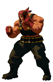
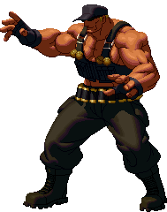
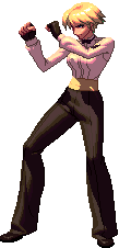
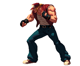
Meet UberRalf and UberClark. The two that began as head swaps but got some mild changes as time went one have once again become very similar in nature. Both fighters have gained a very large amount muscle mass and the biggest different between the two is their heads and the color scheme for their gloves. The body type here is closer to the type you'd see for a grappler type character, which Clark was without the excess body size. To cut down on the workload, Ralf was given a similar treatment. I guess considering their military background, it isn't the most farfetched thing they could choose to do.
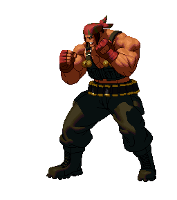
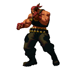
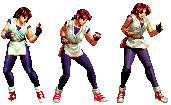
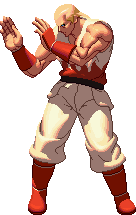
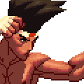
Here's a few of Ralf's basic attacks. There are a few things going on here that are fairly interesting to note. For the first gif, pay attention to Ralf's punching hand and the leg on the same side. The shadow moves along with his hand; SNKP is opting to really play up the use of light source, with the shadows of various body parts being cast on that which lies below it. The second image of Ralf using a knee strike helps to illustrate how extreme the shadow is handled in this game. See how as the leg he is standing on goes completely dark as it receives less and less light source. Once the light source is absent, that portion of the sprite is reduced to 2 colors; one very dark tone and an outline tone. This treatment of color is done on all of the uses of colors within the sprites. I should state that this is easier to see in Ralf's skin tone for those who have monitors that display things too dark to make out the pants in detail. [Edit] It looks like someone liked the Ikaris enough to give them some very interesting palette separations in XIII: There are confirmed screen captures showing that Ralf has a palette that changes his pants to have a camouflage pattern instead of the usual monocolored version. |
||
Just as the male fighters got a substantial change in style, so did the female fighters. Before I get around to showing the new takes on the current versions of some of these characters, let's take one last look at a few quick samples of Yuri's evolution and King.
Starting from the 1994 roots of the series, the style would work its way out to still be fairly based in reality, but gain some animated styling to it in the last few years. A tad silly, but not too bad in most cases.
Welcome back, Women's Team. Having been absent in the first revamped game, SNK Playmore quickly showed that the 3 mainstay characters have all made the jump to the new style. I'll only add a few details to my earlier commentary regarding King, as I feel that I covered her in detail for the most part at the tail end of my KOF study. After talking to someone after the fact, it was suggested that at least for the arm in front of King, the width would seem off on account that the arm was crossing in front of her moreso than in her past stances. A possible explanation why was that it could be based off a stance that allows for a spinning strike of some sort, which would fit in with her Muay Thai background.
Not to completely ignore Athena as she's already here, but the new art direction saw fit to give her an age regression from the standard models of past years and stick her in a school uniform once more. She's gotten quite a bit chubbier as well, as her face is more rounded and legs are far bulkier than in past games. *Editor's note: KOD brought to my attention that Athena is actually a retro take on the character, as she and Kensou's XII designs are actually based on their original Psycho Soldier appearances. Note that I still find it strange looking, as the early version of Athena's sprites had her wearing this costume but with her original body build. Moving onto Mai, she's actually been given a new stance and general set of movements this time around. It's less than subtle fan service here with how prominently her bust is shown off in this particular image, but Mai's always been the fan service character anyway. Her hair seems to have been given a flush cut at the back in this style. The main reason I bring that up is because it's something that gets changed around with some frequency in the official art throughout the years, so it's just interesting to note really. I may need to correct myself on this later, but her design seems to be a call back to her Fatal Fury appearance to some extent, which would make sense as the rest of the Women's Team also seem to be call backs to some extent.
Take a quick look again at the images above, and then back to Leona. Notice that Leona's arms are the only ones so far for the female fighters that have anything above the minimum amount of definition to them. This appears to be part of the art style for this series: unless the character is someone where you would expect some form of muscle mass, they will opt to make use of a sleeker design for the female characters. Because of the military background, it makes sense for Leona to have a more defined build than the others. This treatment won't be common for most of the potential female fighters in the series: the only other one that would probably get more defined arms like this would be Vanessa due to her boxing background.
It's a fairly nice remake of the character overall. The suit manages to help disguise some of the qualms I have regarding the new style's treatment of female arms in most cases, and I really like how the light source is played around with in her suit. One of the transition tones deviates from the rest by adding in a warmer red shade before transitioning into darkness, which adds a bit of visual interest to it. If there is anything that bugs me here, it's mostly that her hands come off as a little strange looking at times. The colored nails make such issues stand out more for Mature than it would in other female fighters. The last thing to note about Mature is that if Vice manages to make a return, you just know that SNK Playmore will give her the Ikari Warriors treatment by having both of them using a similar body and look. Hah. [Edit] Well, it turns out that Vice did return, and they did exactly what I thought they would. At least she still has her own stance. Hah.
The last of the female fighters I planned on covering is Elisabeth, who's gotten a nice change of clothes for this entry. Proportion wise she's one of the stockier characters shown in this section, which puts her somewhere along the lines of Mature and Mai but without the bust being as prominent as either one. The choice of jacket does the same thing for her arms as it does for Mature in that it gives them a thicker outline to work with that looks better under closer observation. The palette choices used in her clothing come off very nicely as well. You can tell just from looking that the fabric used in her coat has a glossy finish to it, where things like Mature's suit and Athena's uniform are more muted in their shade difference and thus have a much more matte appearance. All and all, it's a very nice bit of work here. |
||
Alright, let's move onto another classic KOF team, but this time displaying some male fighters that haven't been going overkill at the gym. In this case, the Fatal Fury team is actually a pretty good team to look at as you've got a few different body builds to look at here.
Starting with Terry, you'll see that he's reverted to his started Fatal Fury look rather than using his Mark of the Wolves getup. Jeans are a little baggier around the ankles this time around, shirt is closer into the body, but Terry remains his classic self for the most part. I find it a bit funny that SNK has opted to not bother rendering his eyes at all this time around, as they would normally be visible in at least some of the frames here. I can guess it's a stylistic carryover from the original frames, which also did the same thing unless Terry was clearly looking upwards or removed his hat. While not as huge as Ralf or Clark, Terry's clearly been working out as well as his arm definition and implied shirt lines would tell you. It's really a nice batch of sprites that serves as a good example of the newer style.
On a side note, Andy's head bares a resemblance to Geese's younger appearance. It makes sense in a way as at one time there were considerations of making Andy and Geese related, but the idea hit the cutting room floor and it wouldn't be till later that we are introduced to the son of Geese, Rock Howard.
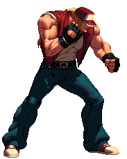
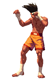
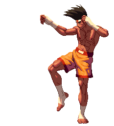
Lastly, we have Joe. Joe can be thought of as the exact opposite of what happened to Ralf and Clark. Rather than giving him additional body mass, the Muay Thai fighter got a lot more lean while remaining very defined. When you look at actual Muay Thai fighters, this change actually makes perfect sense as Joe would actually blend in a lot better now. I'd say that in terms of body definition, Joe is another really good person to use as reference when trying to mimic this style. As his body is mostly exposed, you can get a good idea of how the official artists choose to apply light source and definition. It's also a great example of how a subtle change of pixels can make or break something. Look at Joe's chest and abdomen in these animations. They spend most of the time in shadows, which means the artists had only 2 real shades to work with there. Despite having so little to work with, they can get some really fluid and convincing animation out of it. This fluidity can easily be found in the rest of his body. See how the lower half of his body turns during his elbow strike. Despite there not really being a great change from frame to frame, it comes out very smoothly. Although I wouldn't mind if they had left more of his original body mass, I'd have to say that Joe's sprites are among some of my personal favorite. [Edit] XIII introduced Joe's rival, Hwa Jai into the mix. Hwa himself is a Joe headswap with darker skin and no wrapping of any sort on his hands or feet which make him more simplistic than Joe. It looks a little odd in his default palette to be honest, despite the fact that it's the same body as Joe. |
||
Although I have this section written down as the breakdown of shading, I just want to make sure it's clear that I'll also be covering other things that I think are important when trying to make sprites of this style. Unless you happen to be capable of creating 3D models, I'm assuming you are in the same boat as I then in that you'd be making the vast majority of a sprite in this style from scratch, and thus will be writing things from that perspective. The Magic Number is Seven: One of the first things that caught my eye regarding these sprites is that there seems to be one specific rule that gets enforced a lot. This rule is that if there is a prominent color used for a character, there are going to be seven tones to it with rare exception.This applies to skin, hair, and clothing alike regardless of the material.
I've picked out 3 random samples from the sprites at my disposal to help illustrate things a bit better. The first image covers Terry's denim jeans, the next has Joe's skin tone, and the last has Mai's hair. Despite being fairly different subjects, each have the same number of tones, and they each behave in the same way. Here's the breakdown from lightest to darkest:
Of Light and Shadow:
Note how the light hits all of the top most surfaces on King's body for the most part. This applies fairly uniformly until you start reaching the areas on her pants which are obscured by her raised fists. This is actually an interesting design choice that hasn't been seen in KOF sprites for quite some time. The silhouettes of her hands are what you are seeing there, with it being a bit more obvious on the hand that is crossing right in front and its respective shadow. In those areas of the sprite, it is all tones 6 and 7 in usage there, with things returning to normal just outside of those silhouettes. Color Separation: While I don't have a direct example for this one here as no one has managed to rip from the first game yet, the sprite artists at SNK Playmore did a fairly extensive job for some characters when it came to additional palette options. While it cannot be seen in the default palettes, several characters have had parts of their sprites recolored in order to allow for some level of appearance change beyond just color swapping. For Raiden, some alternate palettes have him without the shirt portion of his wrestling uniform which makes it closer to his initial Fatal Fury appearance. As for known cases of this in XIII, Yuri's pants have several different layers of this to allow for a variety of different types of pants or even a bikini cut. Regarding Body Build: This section is a bit more opinion than fact based, but I've noticed a few trends within the visible sprites so far. I'll try to put these thoughts down in some brevity:
|
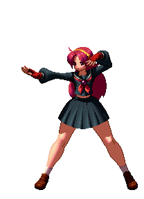 Let me toss in this image of Athena, as the artist's approach to Yuri has a lot in common with what they did to Athena in the first game, although not to the same extreme. Both of these characters have been given more youthful looks this time around, with their general builds now resembling something you could see out of a modern Japanese animated series. Yuri's been given a haircut this time around and is somewhat thinner this time around, which is exaggerated a bit more as her stance has become more narrow as well. What you can't see here though is that the sprite artists have actually done a lot of color separation to her spandex pants, which has been cut up into several different sections allowing for things like bikini cuts, shorts, and leg warmers.
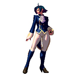
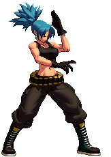 Here's Leona's current design for these new games. As you can see, it matches what had been done for Ralf and Clark and gives the lot of them a unified look. Of the female fighters I've shown here so far, I'd have to say I like her interpretation almost as much as King's, although Leona does have something done to my liking that you won't see in the above sprites. Namely, her arms.
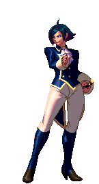
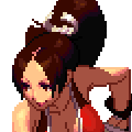
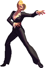 They seriously brought back Mature for XII? Now this was a pleasant surprise. Her appearance seems to be a modified version of what she might have worn while working as Rugal's secretary along with Vice, only with an eye patch that reflects some of the aftermath of working with Iori in the past.
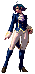
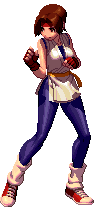
 Andy's made a return, and has really gone retro this time around. Having donned his original Fatal Fury look once again, Andy's a real throw back to the original entries of the KOF series. His lighter skin tone and clothing helps to really show off how the new artists are handling the the tones and shading within the series now, so it would work as a decent reference for those looking to replicate the style. Only thing to consider doing differently is the boots here; while they do the job here, it really comes off looking a tad too simplistic compared to everything else here. Strange.
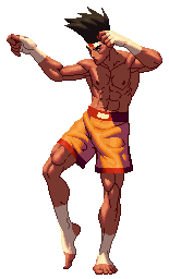
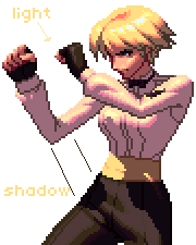 The light source used for XII styled sprites is primarily above and a bit to the front of the fighter. While I can't say with absolute clarity just yet, it's fairly safe to say that if you are working from a 45 degree angle, you'd be fairly correct here.