Dec 27: First revision of this page, adding some Capcom examples.
Introduction to my Process |
This long overdue write up should be considered supplemental reading for my sprite art related videos on my youtube channel (Here's a link to the related play list where you can find the commentated videos showing me develop the animations shown here.) If you have seen the previous pages showing my process for starting up single sprites, you might think that extending that to animation would just be a matter of repeating that same process multiple times until the animation is done. This would be wrong. I'd say it's fairly easy to make a one-off sprite; you really just need to worry about making something look right at this one angle for what represents a single brief moment. Once you start adding things going on before and after, suddenly you have consistency of proportion, pacing of movement, and developing and maintaining a certain personality through those frames for lack of a better explanation.
|
|
The story behind this particular animation is that I started working on an unrelated unfinished frame from a game project by a fellow who goes by the name of Prodigy; the initial frame looked to be based on cps2/3 styled work, but was a tad narrow, so I wound up not only tweaking its width but eventually making a preliminary animation out of it. After that was wrapped up, I realized the skin tones which Prodigy had used for the character were actually really nice, so I found an excuse to use them elsewhere.
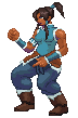
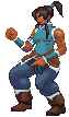
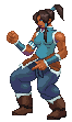
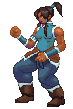
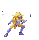
My starting point for Korra, the namesake protagonist from Nickelodeon's Avatar: the Legend of Korra, was to begin by building some animation for the arms and upper torso. In terms of ideas and reference for her arm movements and the stance in general, I recall pulling inspiration from Martial Masters' Red Snake character as well as Yun and Yang from the Street Fighter series to some extent.
The next step for me here was to begin establishing some basic movement for the legs and feet. What I ended up doing to start this process up was to add some back and forth swaying as well as a small bit of vertical movement. The forward movement was honestly excessive, so I would begin to comb things down within the next two versions.
I've now started cleaning up some details like the bounce of the pants and giving movement to Korra's bangs. I have also made some touch ups on items like the boots, which beforehand were doing on odd stretch on the forward moving frames that should not have been possible. Of course, that was really only part of the problem with the legs, as I would realize I still had a bit too much sway back and forth here.
On this fourth take, I've now noticeably cut down on the swaying and the extent of the fabric bouncing on her pants. Having gotten things down to what I considered acceptable, I now went back to the layers where I put her arms and finish rendering the line work and details on them, adding a bit more hand motion to her left hand. I have also slowed the pace of the animation somewhat more. |
||
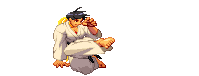
Like I had said at the end of the CPS2 study, I was probably not done with this particular design by Diepod just yet. One of the big reasons for that is that she allows for, pardon the pun, a lot more flexibility than what could be afforded by a strictly human character who was bound by conventional rules of anatomy.
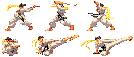
Korra was a sample of an idle animation; what was done for Genocyde's example here was to give her a basic attack that is aimed at sending the opponent airborne. Enter the VS Style Launcher:
Yes, this was a mess for several reasons. First, the animation itself was incomplete with no established transition back into the stance or anything even logical. Second was blatant disregard for standing axis / floor position. Sure, I could easily adjust that on the fly to get it back to making sense, but that really should have been established already. The next big problem was that the transition between facing towards the viewer and away was entirely rushed if not missing in these frames. There was a lot of missing information overall.
My first idea of just where to begin was to start filling in the blanks on the upward swing and turn. This was done by polishing up the startup frames and adding an extra holding frame near the start as well as along the end of the swing. The leg transition while improved has not been solved as of yet at this point, nor has the transition back into the idle animation. Another issue that has come up is that I have inadvertently created a shifting foot in the front there, which is something that I won't properly attempt to address till after the next progress animation. In terms of changes from the first draft, it may as well be night and day. As Geno's arm is turning into the blade hand and swinging forward, her body now moves in better unison to accompany it. The blade hand is thus given a better sense of weight behind it, where before she was basically standing normally at the end and the initial knee bends looked more stylistic than anything else.
At this 3rd point, I've now thought that in order to get the transition I wanted, I could achieve it by having Geno step forward into the stance rather than step back into her old position. While in theory this could work, my execution on this particular attempt was not a total success. The initial part of the animation was fairly fluid, arguably overly so, which made the transition back into the idle stance actually very choppy by comparison. Additionally, this step toward on what honestly was not an overly strong looking attack despite a bit of exaggerated leaning was not entirely logical. In hindsight, the extra forward step can only work here if there is a follow up section to the attack. This leads me to reconsider the extra motion, and actually return to the original idea. One good idea that had come out of this though was the pacing change upon completing the swing itself. The very deliberate pause of motion around that point makes the attack look heavier, something capable of sending an opponent flying.
This latest version of the animation reuses parts of the last version's transitions, but uses them as part of a retreat back to the original standing spot. I've also exaggerated the step forward and bent that same leg on the start up frames to make it a lot more logical and give it better alignment to the original stance. This helps to reduce the sliding foot issue by quite a bit from the earlier takes, although it is still not quite perfect. For example, the change of pacing on the end of the swing may be too fast now, removing some of the weight that I had achieved in the last take. The final iteration of this animation will probably have 1 extra frame around that point to give that weight back before transitioning to the original position. |
||
First off, I'd like to thank Zwei Fuss for ripping the animations which I am using for examples in this particular section of the study. While it may seem odd that I would include a Capcom specific section within a study of sorts that covers my personal animation process, there's a perfectly good reason for this: it's not a farfetched thing to say that I basically grew up on Capcom titles with a big emphasis on their fighting game franchises. Remember the photograph of all those art books? That wasn't a random picture borrowed from some foreign site, but taken straight from my own collection which has only grown since that point. Considering the amount of time being exposed to games from this company, it really should be to no one's surprise that my own personal work tends to borrow a lot from these earlier titles with a few other influences worked in to complement what my general style consists of at this point. Before Capcom's now virtually exclusive use of 3D models in their fighting game titles, they used to make use of more classical animation practices. The basic line work for character frames were individually drawn by hand and then later scanned in and finished up digitally. Unfortunately, it's quite difficult to come across to many examples showing these early bits of line work: aside from some of the samples I recall bringing up in the CPS2 study as well as a few loose examples shown for the Street Fighter 3 series within the Japan only Capcom Secret Files booklets, there is not much of the early stage to look at. Fortunately with the advent of programs such as Artmoney and Cheat Engine, it became possible to playback and record / capture the individual finished frames from the games themselves. From the looks of things, Capcom really did love to use certain animation techniques and found creative ways to take advantage of both classic techniques and the frame count, particularly in CPS3 era titles, to take a few shortcuts along the way.
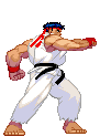
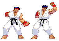
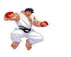
Take Ryu's close fierce punch for example. Viewing the whole animation, it does look fairly smooth overall, as do most of the animations from this series. Of course, it's when you start looking at things on a frame by frame basis that things really get interesting. The first picked frame is the transition frame between Ryu's punch being wound up to now reaching the attack frames; the forearm and hand are deliberately made wider and unfocused to give the suggestion of blurring due to movement speed. Capcom tends to handle what are supposed to be quick attacks often in this fashion or by literal use of speed lines as can be seen within the air medium punch right afterward. I'll be covering it moreso in a proper CPS3 review, but do take notice how on that secondary still his arm and chest have very rudementary shading compared to other frames. Part of the reason suspected for this is that as you wouldn't be seeing these frames for a very long time, they could skip over the detail work of shading. Heck, his fingers on the punching hand are basically just outlines filled in!
Makoto's use of motion blur is a tad different from Ryu's in that it tends to actually be more extreme in its uses. I'd actually say the application here would be a bit more in line with the more exaggerated use in the Vampire / Darkstalkers series of games. Still looks fairly smooth, but when you get to the still frames? The transition from one position to the next tends to actually be really abrupt.
These 3 frames sequences from both of the above attacks were not just randomly picked, but are in fact each in sequence. What that means is that during the standing fierce punch, the sudden transition from her arm still being extended outward to blocking our view is done in a single frame and disguised by a gradient based blur effect to suggest it was a very fast chopping motion. For the crouching kick, not only was that kick fast, it was so fast that visually the foot not only blurs but in fact visually warps into a nondescript form until it returns to a slow enough speed that we can comprehend the details of it again. (Also, until the rest of that pant leg catches up. Hah!)
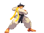
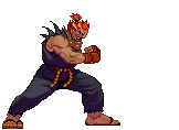
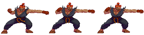
Gouki's fierce punch doesn't feature any motion blur, but does do something interesting in order to give the attack a bit more visual kick in a way that you may not even notice unless you are really looking. As the punch reaches its attacking frames, it makes use of the stretch and squash technique to give the attack a bit extra range by visually stretching Gouki out. Rather than just making his arm longer though, it actually makes use of a single tick long frame where he hyper extends himself before reverting to a more normal position. The only way you might see this frame is if you are really paying attention just as he makes contact.
In terms of the recovery frames for this attack, a number of them are literally the same two frames recycled in order to pad the animation a bit while giving the suggestion of a greater force behind the punch. Not a new technique by far, but still gives a decent bang for the buck in terms of visuals.
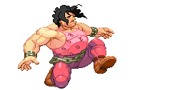
While I could probably grab a number of different animations to prove my point, Hugo's sprite set actually recycles a number of frames of his actual body and pad that number by having the chain belt bounce around a bit extra to give a greater sense of fluidity. Another common trait in his sprite set is that during the actual contact frames, his hair will suddenly flare and spike outward before returning to a more relaxed state of movement. |
||
|