Feb 22: Other than layout change, nothing new here. Stay tuned for updates.
Introduction to my CvS Sprite Observations |
This popular crossover series doesn't need much of an introduction, but here goes anyway; a collaborative deal struck between Capcom and SNK spawned a series of different games which included multiple fighting games and a set of card based strategy games. Capcom made Capcom vs SNK (slightly later a minor upgrade called CvS Pro) and its sequel Capcom vs SNK 2. SNK would later make their own fighter, SNK vs Capcom: Chaos for the Neo Geo along with the SvC card games. For clarity, I'll be talking about sprite work from the Capcom developed CvS1 and 2 games for this study. The character roster primarily draws from the Street Fighter and King of Fighters series, which were the bread and butter franchises for both companies when it comes to fighting games. The exact reason isn't known why more variety wasn't chosen, but I personally see two main explanations for the roster selection. The first is that these characters would be most easily recognized by fans of both companies, and thus would be an easier sell. The second is that by using more familiar characters, especially on the Capcom side, it would allow them to rehash old material from their earlier titles and save some development time. A good chunk of the characters that came from Street Fighter games use their Street Fighter Alpha sprites with some additional animations being drawn where necessary. Only a few like Ryu, Ken, and Gouki got immediate redraws the first time around, and Chun Li only got a revised set in the second title. As for the SNK side, they were the bulk of the new spriting work for this game on account that Capcom had no comparable source to borrow from. The characters chosen were drawn up in a brand new style specific to this game that was a modification of the SFA look from Capcom's past games made to fit natively in a 320x240 resolution as opposed to the "fat" look attributed to most CPS2 and 3 titles. I'll elaborate on this later, but this effectively gave them the slimmer nature of KOF titles but with the muscle mass of the usual Capcom games. The chosen SNK roster tended to get their most iconic look or at least earliest one in cases like Athena and Rugal.
|
|
There are a few fundamental details about the sprite style exclusive to this series that should be kept in mind if you want to try and mimic the look for your own sprite work. As long as you recall these few things, you are off to a good start.
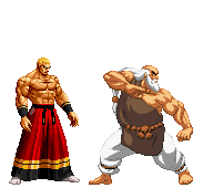
The first thing to keep in mind is that the light source used in this series is directly from above and not from an angle. If this image looks familiar to you, it's because I use it on the main Sprite Discussion page. The light source on KOF sprites and SFA sprites both come from above and slightly in front, while the CvS source comes from directly above. If you are converting something from one of these alternate styles, you need to keep this shift in lighting in mind to keep your newer work more in line with the commercial examples.
Continuing on the topic of colors, the third thing to know is how the various shades get used. Using the example of Rugal here, let's look at the breakdown of his red coat and pants, which uses 5 colors. I'll start from the lightest tone
|
||
If you're wondering why I'm specifically targeting the KOF characters, it is because they make up the bulk of the SNK roster in these games, plus the Capcom side recycled so many characters from earlier titles that there just aren't as many good examples to pull from there.
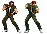
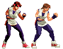
Iori's conversion is a good place to start. Right from the start you can tell that there's been a proportion change to make his legs longer and his hands larger. His hair and face have been simplified a lot from the source look, and while his right arm still has some complex folds in there, it's still easier to digest than the KOF original. The pants are much cleaner than the original set, focusing more on the key highlights and not much else. Everything is also a lot more colorful than the muted tones of the original frame. [Edit] To correct an oversight, now included is a more recent frame of Iori than the one I started off with; to be fair the stance in this frame is much closer to what was used for the CvS stance albeit learned further forward than the more neutral position of 2nd frame in this example. The newer frame is also more colorful than the earlier one, but that same colorful nature happens to make the dark jacket harder to see clearly at the same time. You'll also see that the pants and white shirt share more folds with what the CvS model used. This newer KOF frame is clearly what was used for reference when the CvS frame was made, but I leave my original assessment intact as various parts of the comments there still apply to the newer frame as well. Despite having an alternate look available by this time, Kyo reverts to his '94 school uniform look for these titles. Like Iori, he's taken a turn for the more colorful. In terms of his body, his uncovered arms reveal that he's bulked up a bit, or at least now makes full use of Capcom's style of definition. (Not readily visible in this animation, but it's there.) Clothes are simplified from their source with less clearly defined folds being present. Due to the palette change, you can actually see certain details more clearly now, such as the crease lines in Kyo's pants.
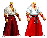
Moving to Geese, it's not even subtle just how much his overall design has simplified from the base KOF version. The hakama pants are nowhere near as detailed as it was before, and the trickiest part in this entire look are the folds that remain and the recycling of colors for the skin and choice elements of clothing. Yuri's scale actually stayed around the same in the changeover, although her hair is much lighter now, as are her pants. The white gi has less highlights in the shadow filled areas than in the past, and her skin tone is actually lighter as a color or so is shared between it and her hair. A good transition overall. |
||
Okay, this is something that has been a nagging thought for quite some time, and here's as good a place as any to air it out: it takes more than just upsizing a King of Fighters sprite and slapping on a new set of colors to make something a convincing CvS sprite. These are minor, cosmetic changes at the best and will not get the job done. Yes, I know this is something most of us have done at some point, myself included. This still does not make it right, and here are a few reasons why:
The first frame shown here is the completed edit by Dampir. The second is an original KOF frame from 2k2, and the 3rd is the same, but with an edited palette. If you compare the first and last images, you'll probably notice that with the exception of some shading changes made to the pants, shoes and gloves, things match up quite a bit. If anything, the updated glove makes things harder to see because the new tones are so close to each other, and the glove underneath was black for a reason. The face and hair are identical save an added shade to the hair and blue eyes added. I don't even know if Kula has blue eyes now that I think about it. Did Dampir make some effort to change the frames to reflect the rules? He did on areas like the legs and the end of her sleeves. This effort was mostly extending the lightest shade to the extremes of the earlier 2nd shade, which flattened things out in their respective areas. He left most of the original folds untouched though, which leaves them fairly complex looking, more so than what you would find on the commercial sprites in most cases. Is it possible to convert from a KOF sprite? It is, but you will need to effectively redraw substancial parts of the frame to make it work, unlike the cited example. If large parts of the original sprite can be clearly seen and recognized, you probably have not gone far enough. |
||
Sample Conversions and Explanations of Process |
Here's a sample I set up over the weekend to illustrate some of the considerations that I personally go through when working something into this style or at least a reasonable knockoff.
Clark's color scheme was broken down to fit the 16 base colors, and the contrast adjusted to something closer to a CvS palette. This means that certain things reuse colors, such as Clark's hair, the yellow of the cartridges on his belt, and the silly tiny grenades.
While this is a closer fit compared to what we started with, note that Clark is effectively Tizoc sized because of the carryover from his XII proportions. That's honestly a bit much, even if Clark is supposed to be fairly muscular in this new look. He's also too wide still in general, so some slimming is required.
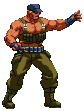
I used both Iori and my earlier resized edit as reference, but opted to scratch sprite Clark in this case. I started building from the upper body down to the legs to establish the height of the character, comparing measurements between the resize and this frame just to make sure things didn't baloon or shrink too much. XII's shading wasn't too far removed, so I caried a number of general elements over in my redrawn frame, but Clark did slim down to more human proportions compared to the original frame. Some additional changes later to palette and shading, and we wind up with the frame to the right.
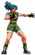
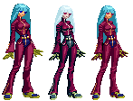
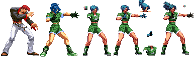
Now let's go with something that is a pulled from KOF classic: Leona in her original look. The sample sprite used here is from Dampir's current resized and slightly edited sff swap in progress. Checking her scaling against Iori in KOF titles, it turns out that Dampir actually got the scale fairly spot on, and at least he made some effort to change the shading on her legs. The arms look close to default though, as does much of the rest actually. Like the Clark example, I start building up the body in general to get a good size compared to Iori and Dampir's approximation, opting to slim her up a bit. I add on the arms after establishing the rest of the body, since her right arm would be in front of her making it difficult to detail things below it after putting the hand on. I wrap up the sprite by tackling what's left of the hair, putting things into the 16 color limit, changing the palette until I got something that worked, and making a series of changes based off some feedback from a few people on hand. Hopefully you'd agree with me that it is a bit more convincing than the resize and minor reshade that is frame 2. I do not claim that these are perfect conversions (my own personal touches always manage to creep their way into works,) I can say that with some effort, it's possible to get something that is fresh looking and convincing than what could be gotten with the usual shortcut. |
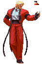 The second thing is that the official color limit is 16 colors with the transparent shade. This is the exact same amount as King of Fighters sprites as well as most CPS2 era sprites such as those from the Darkstalkers and Street Fighter Alpha games. What this means in this case is that most colors will end up using 4-5 shades at the most and there will likely be some that seem multiple uses throughout a sprite. With the example of Rugal here, the lightest tone in his shirt is also used as the highlight for his hair, and the black shades finds use within his clothing as well as his eyes, mustache, and outline of his face. To maintain the 16 color limit, you have to make some colors very flexible.
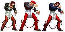
 Of course, this section couldn't be complete without a good sample of why this sort of thing doesn't work. While you really don't have to look too far to find an example which fits the above, it just so happens that Dampir put out yet another one of his King of Fighter converted sprite sets which without fail always manages to hit several of the things mentioned above if not all of them at once. Don't get me wrong; he actually has improved somewhat over time, but he still works as a really good example here.
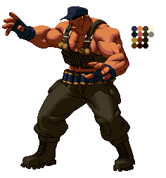 Since conversion is the name of the game here, let's use XII Clark as the example here. I realize that the earlier example makes use of a pre-XII sprite and thus works on a different scale, but I argue that as the scale is doubled only it can still work. Also, my key point about body proportions still stand in both cases, as neither version are a perfect fit for the cartoony style that CvS uses.
 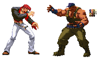 My next step was to bring it down to the intended scale. This was done by measuring things to XII Iori, and then resizing Clark until he stood at around the same difference when compared to CvS Iori. Give or take, this was just a little under half scale from where we started: I think the value I went with in the end was 47% of the original.
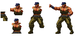 ->
-> 
 ->
->